Posts tagged multifamily
Project Spotlight: Greta Apartments (Completed) and Graceland Apartments (Under Construction)

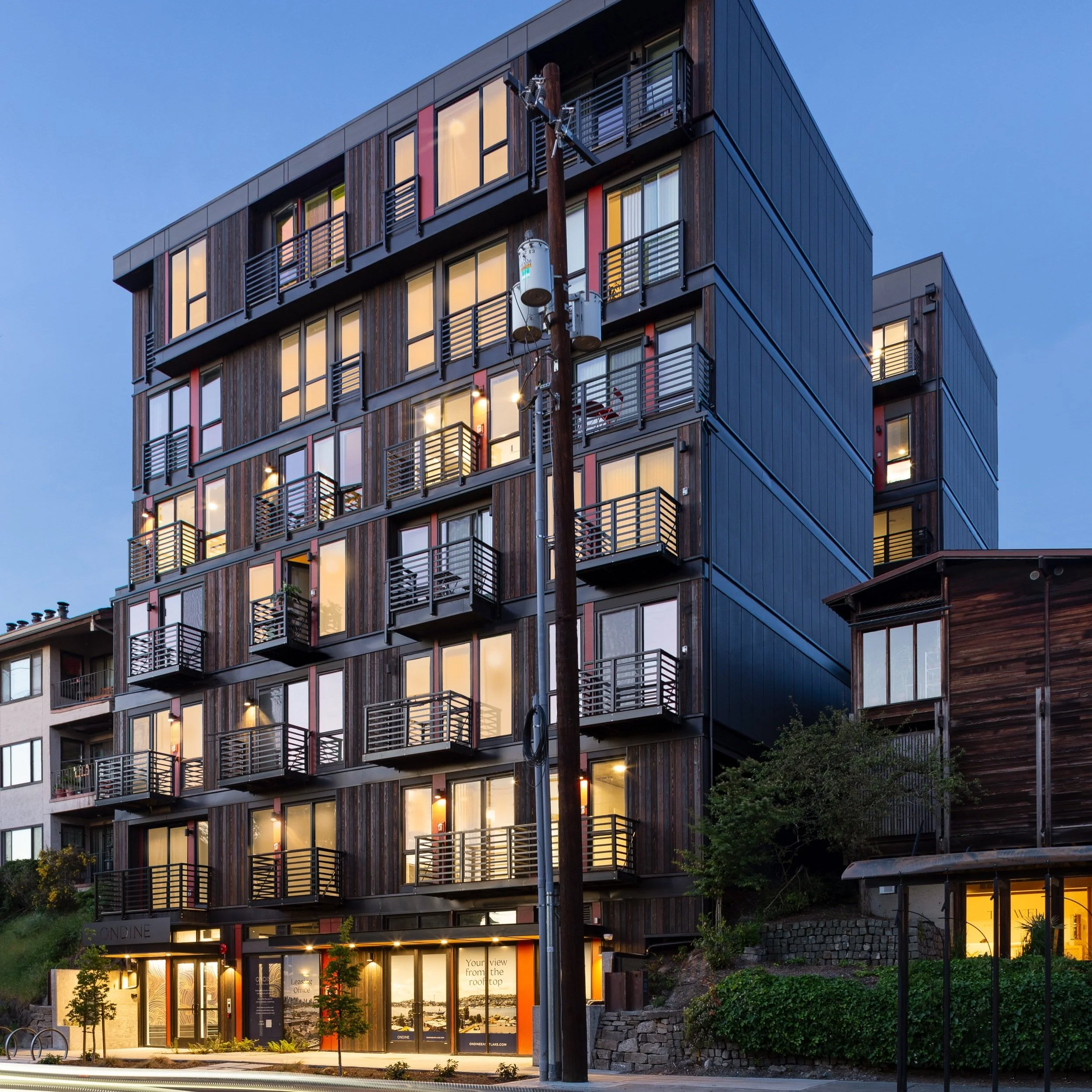
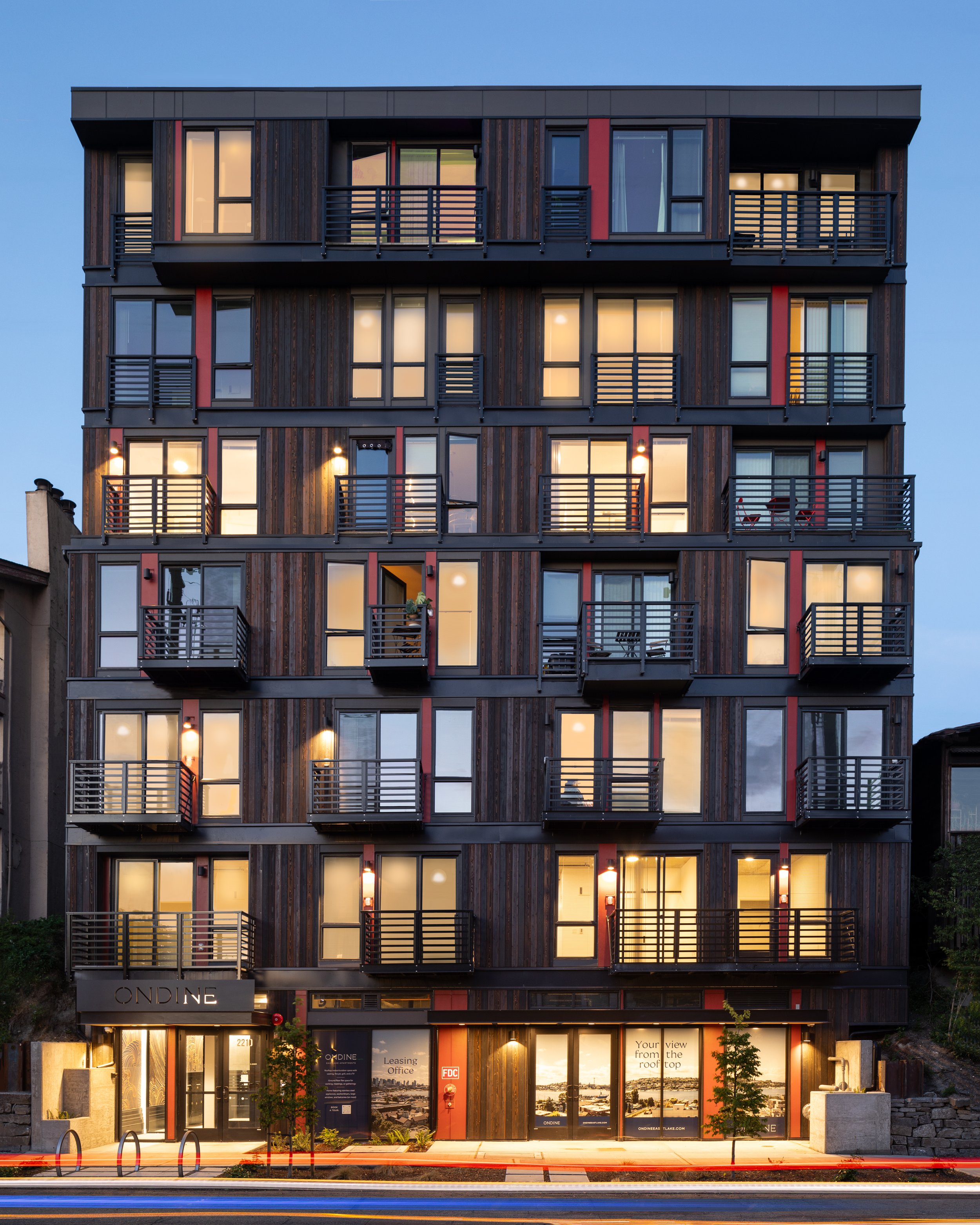
b9 architects’ is thrilled to showcase the recently completed Greta apartment, a project that exemplifies our commitment to providing excellent design for all of our projects regardless of type and scale. A 33-unit Small Efficiency Dwelling Unit (SEDU) apartment completed earlier this year in Seattle's vibrant University District, Greta sets the stage for a sister project Graceland, currently under construction just next door to the rear. Together, these developments elevate residential density while adhering to a shared commitment to executing the design intent prioritized by a collaborative project team.

b9 architects kicked off both projects in 2018 to ensure they would vest to the then current municipal code. After vesting was secured, the Graceland went on hold while the team spent their focus completing Greta, the smaller project. Greta stands out with its material palette, commercial feeling, street-facing lobby and a thoughtfully designed small courtyard. It is a departure from the conventional design and entry placement in similar buildings nearby. This innovative approach\ welcomes residents into a space that fosters community and engages the street front. 


Greta boasts high-quality materials such as natural finished Minerit and black stained cedar siding, creating a visually striking and high-contrast facade. Recessed balconies add depth and further enhance the aesthetic appeal, showcasing a commitment to elevating the urban living experience. Additionally, the layout of Greta prioritizes natural light and privacy, with nearly all apartments designed as corner units. This intentional configuration not only maximizes access to daylight but also minimizes privacy concerns, creating a comfortable and inviting living environment for residents.


As Greta was wrapping up construction in 2023, the b9 team focused on completing Graceland’s entitlement processes and construction drawings. Phasing the two projects allowed us to learn from the first design and construction process. We saw our client’s commitment in executing the design intent of Greta, and worked to bring our BIM model and documentation to our current standard in preparation for a robust building phase.
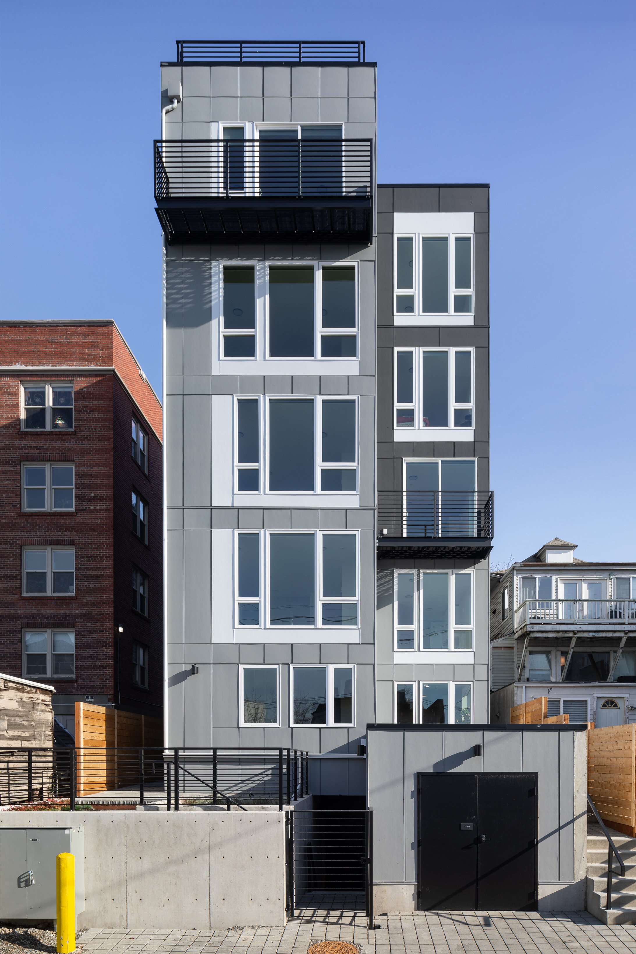
A larger, more complex project, the 54-unit Graceland introduces an exterior lobby as part of its entry sequence, engaging residents and visitors in a unique double-height open-framed portal from the street into a central courtyard. This innovative design fosters a sense of connection and community right from the moment of arrival. Distinguishing itself further, Graceland features predominantly exterior circulation. A steel stair directly facing the street and exterior walkways at all floors contribute to the project's dynamic and engaging urban presence. Residents will experience a seamless blend of indoor and outdoor living.


Leveraging the advantage of a double lot, Graceland incorporates a central courtyard accessible to all residents and visitors. An indoor amenity "living room" anchors the rear of the courtyard, providing a space to activate the outdoor environment and foster a sense of community. The landscape design for the project was specifically designed to connect the sidewalk to the shared amenity space and exterior stairway with varying pavement materials and a series of small Maple Trees and landscaping to maximize greenery in the courtyard.

We are excited to see these two projects complement each other and add meaningful density to the University District. b9 architects is always interested in creating thoughtfully designed spaces in all of our projects, no matter the size or budget, and we are thrilled to be working with a client interested in the same. Greta and Graceland are proving to be exemplary precedents of this project type in this neighborhood.

 
Project Spotlight: 13th Avenue Apartments

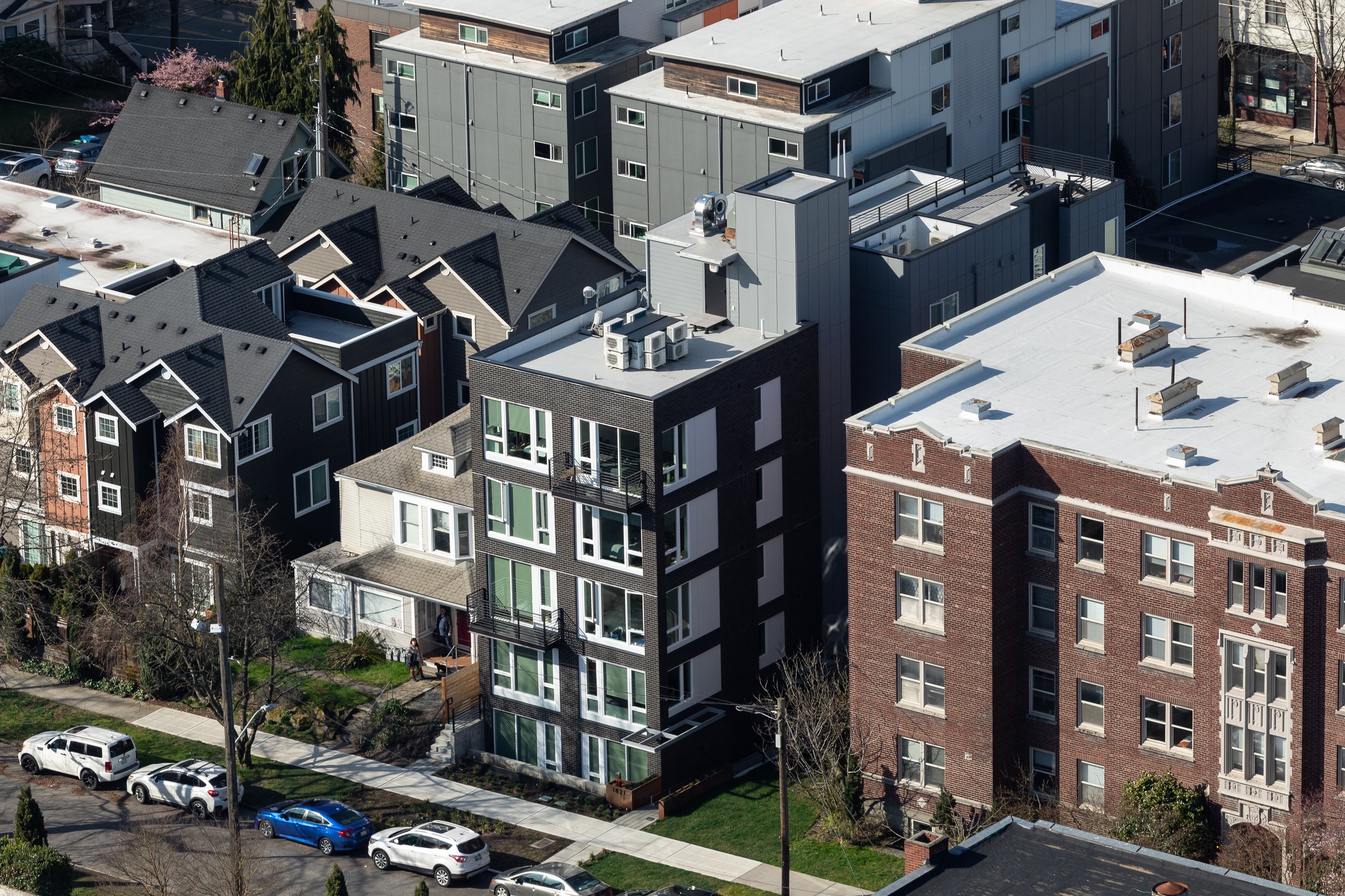
Completed in 2023 the 13th Avenue Apartments features one of b9 architects’ cleanest and simplest designs to date. Seeking our help in 2018, the client had already gone through an early design process with another architect, but the design they arrived at could not be realized due to code compliance issues. Through a flexible and collaborative design process, the team created an elegant, 20-unit infill project, mid-block on 13th Avenue in Seattle’s Capitol Hill neighborhood. With an elegant and organized facade that belies its complicated design, the 13th Avenue Apartment represents excellence that can be achieved with the right client, material selection and detailing.

When the project first came to b9 architects, it looked very different. With another firm’s preliminary Design Review proposal that did not have a path to meeting Seattle’s land use, energy or building codes, our design team worked with the client to propose a new solution. After an initial site investigation, the client agreed to have b9 restart the design process, keeping the idea of two structures, but connecting them with a series of stacked exterior walkways and interior stairwell and elevator. This strategy allowed the “front” structure to act as a centerpiece for the design while the structure in the rear could act as a secondary element. With an engaged client and multiple b9 team members owning specific aspects of the project, the design process focused on collaboration and quick decision making to move the project forward, helping the client make up for lost time.

The project design takes advantage of the “single exit” allowance in the Seattle Building Code. Limited to 4 units per floor and a maximum distance between each unit’s entry and the stair and elevator, the project benefits from providing only one stair. The elevator permits the project to provide a small roof deck for all residents with access to amazing views of downtown Seattle, the Puget Sound and the Olympic Peninsula and Olympic Mountains beyond. The circulation spaces are the “connector” described above that tie the front and rear portions of the structure together. From the street, the building reads as two elements due to the circulation being inset from the north and south side facades. The rear facade shifts half of the mass to provide relief for the homes across the alley and to create a variety of unit types within the project.


Due to the dimensions of the site, the modulation at the center of the site creates relief to adjacent sites, similar to many of b9’s infill housing projects.  However, the difference at this site is that the front facade is purposely clear and simple. The Design Review process in Seattle frequently encourages projects to undulate massing to create depth along street frontages. With a site at 35’ wide by 120’ feet deep, we were adamant that the front façade should be flat and create depth and texture primarily with material expression. There is no space for the front facade. Instead of shifting in or out, the 13th Avenue Apartments relies on simple detailing, a brick frame or grid complemented with contrasting infill panels and large windows and doors. As an assembled integral colored material, brick creates texture and depth on the front volume of the project. Limited to two projecting balconies, this is the simplest front facade b9 has designed. When taken as a whole, the project is complex, carving out the center of the site to setback from an adjacent Single Family home to the south and established brick apartment to the north.


Project Spotlight: Portal Apartments - Fremont

As the first apartment project b9 architects was hired to do, The Portal in Fremont holds a special significance for the firm. From the outset, the client’s strategy included petitioning the City of Seattle for a site specific contract rezone, a process through which the City Planning Department, and finally the City Council could vote to change the parcel’s land use designation based on the development’s proposed design. In undergoing this process and extending the permit timeline, the project was able to gain floor area and height above the limit of its original zone requirements. Working through this process would also make this one of b9 architects’ most collaborative projects to date.

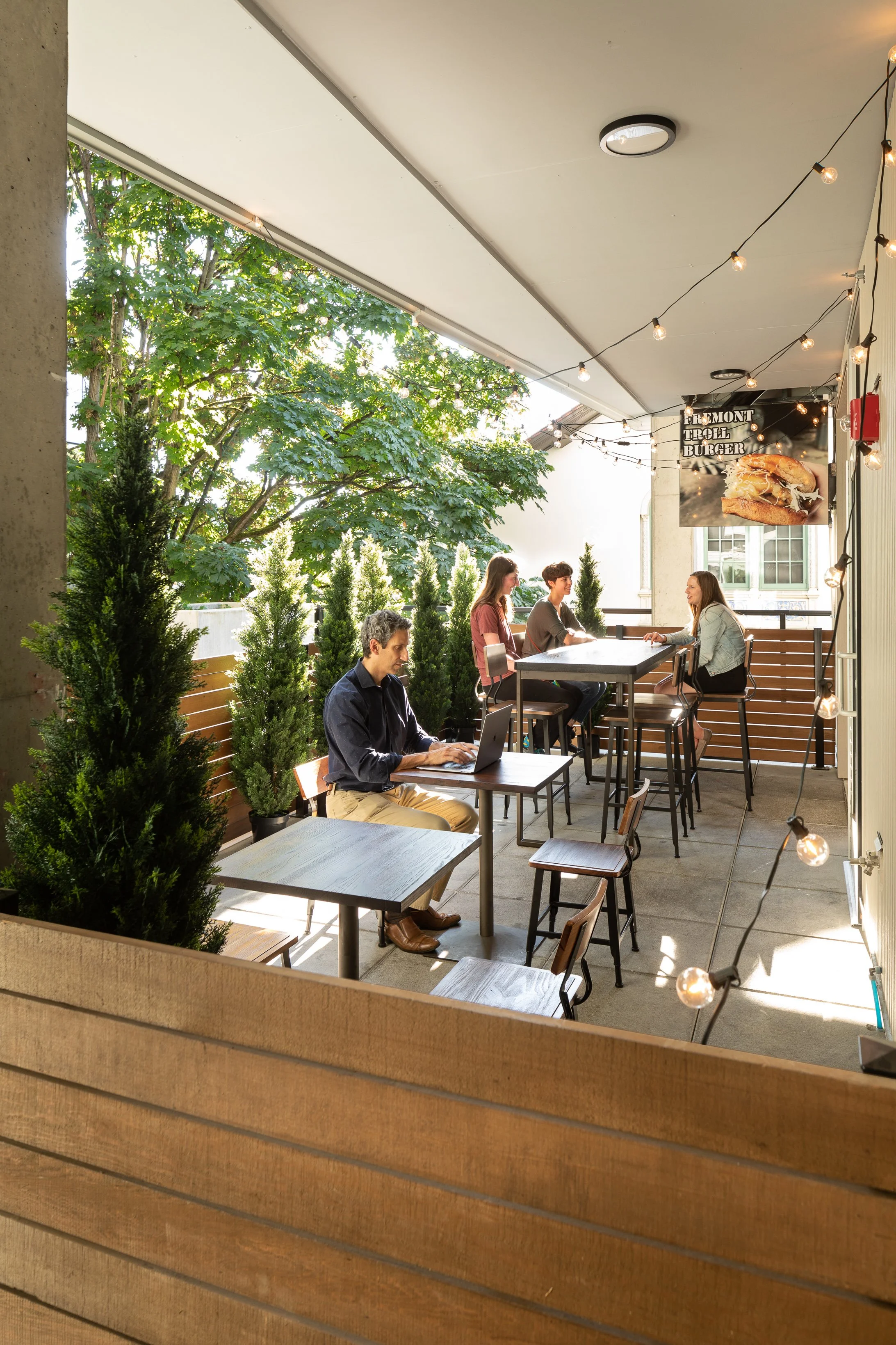
 From the beginning of the project, the team wanted to design a building that would feel rooted in the neighborhood. Through the Contract Rezone and Design Review process, b9 architects met with community members and organizations to hear their needs from the new project, and collaborate on the final design. Fremont, known for its eclecticism, is home to a number of famous public art spaces and events. Within walking distance of Portal, are the famous Fremont Troll, the Waiting for the Interurban statue and pergola, and the statue of Lenin. Annually the Fremont Solstice parade runs along 36th Avenue in Fremont featuring groups of nude, body painted cyclists. To match the community oriented spirit of the neighborhood, Portal was designed with a porous commercial space at street level. A restaurant space with roll up garage doors facing the street, and the building's interior courtyard allows customers and residents the ability to pour out into each space, blurring the boundaries between public and private space. This initial strategy carried through the entire Contract Rezone and collaborative processes with the community.

In general, a contract rezone through the City of Seattle would suit a larger development of aggregated parcels, covering perhaps a full block or more, and requiring design presentations to the neighborhood Design Review Board. If approved there, the strategy would be presented to the Seattle Hearing Examiner, who produces a report and recommendation to the Seattle City Council for approval. For Fremont Portal, the team committed early-on to undergo this process for this one 8,000 sq ft lot by itself. On a slope near North Lake Union, the site is adjacent to the historic landmark building of the Fremont Branch of the Seattle Public Library, and the historic George Washington Memorial Bridge (Aurora Bridge). To achieve this ambitious goal, the project team began several collaborative relationships; land use lawyer Josh Brower, joined the process early in the design review process to guide the team, while Principal Brad Khouri and architect Brian Johnson began a conversation with the Seattle Public Library and the Fremont Neighborhood Council to secure their support for the project.

The Seattle Department of Neighborhoods oversees all buildings with historic landmark status.  As part of the review, DON, wanting to ensure that the building proposal through the Contract Rezone did not obstruct  access to natural daylight, requested a shadow study to specifically examine how a building at an increased height would impact the three Reading Room windows on the landmark structure’s east facade. Fortunately, b9 had determined early in the project to create an internal courtyard that carved away building mass creating a void adjacent to the historic windows. After creating a shadow study in our BIM software, ArchiCAD, b9 architects chose to remove a unit from the top floor of the south west corner of the project to ensure the library kept its access to natural light. This move also created an opportunity for the project: to create a shared resident patio space on the fifth floor.

A second collaborator on the Portal, the Fremont Neighborhood Council was an important organization for the contract rezone process. Their support of the project would go a long way in securing approval from the Design Review Board, and other entitlement processes within the City of Seattle. The team reached out to the group early for their input and guidance on the project. In the conversation, the Fremont Neighborhood Council leadership pushed for more two bedroom units. In the initial Early Design Guidance meeting, the Design Review board asked for the proposed bulk and mass be reduced significantly along its north side, which resulted in the project losing sevenn of the eight proposed two bedroom units. After coordinating the reduction with the Design Review board with the ideal unit mix from the Fremont Neighborhood Council, the team found four more two bedroom units, while only reducing the total number of units by two, from 56 units to 54 units. For comparison, the code compliant version without the requested Contract Rezone would have resulted in 44 units. Per the Fremont Neighborhood Council’s recommendations the project went further in creating transparent spaces to combine the commercial and residential uses. Large windows to each commercial space flank the residential lobby creating a full line of sight through each space.

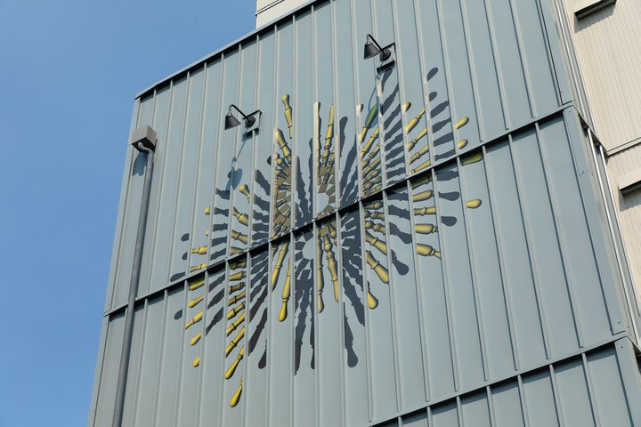
The Neighborhood Council also worked with the team to integrate public art installations with the project. The team reached out to 4Culture, a Seattle-based art advocacy group to orchestrate a search for public artists for the project, from Seattle and beyond. Local artist Caroline Davis represented b9 architects in the search that selected Verda Alexander, a renowned Los Angeles interior designer. Inspired by Fremont, Alexander iterated on her theme “Portal”, which would carry on as the project’s namesake, to create two pieces of public art. With a desire for the art to be intrinsic to the building, rather than additional, Alexander worked with our design team to detail the building's siding, engraving the art directly into the sourced brick cladding. A second art piece, originally proposed as a glass mural attached to the project, became vinyl applied directly to metal siding to best resemble actual building cladding.

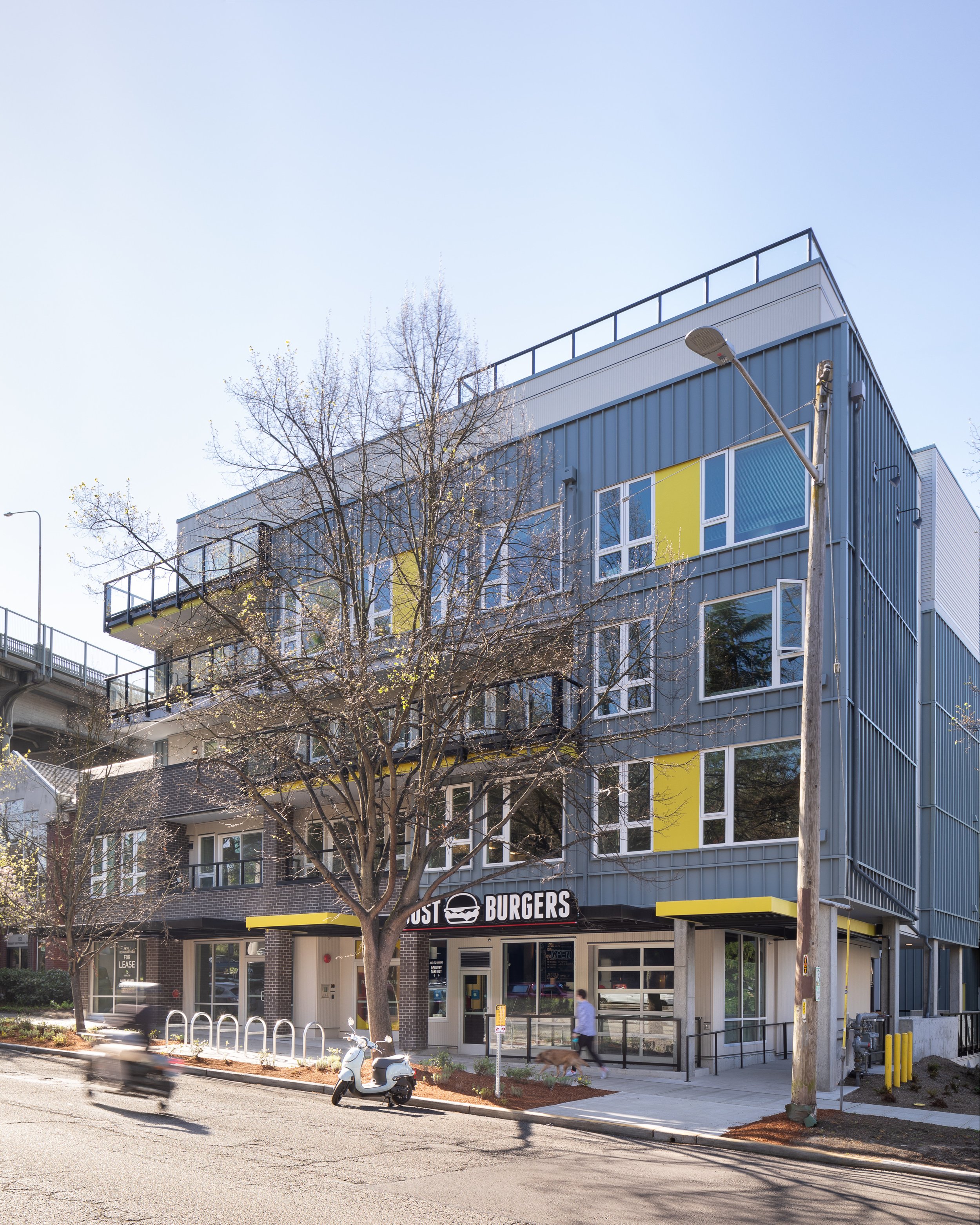
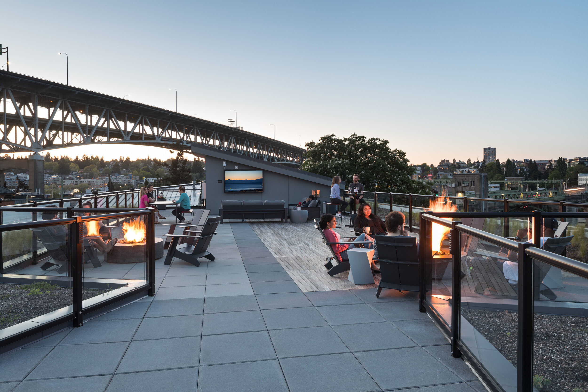
Thanks to a highly collaborative design process facilitated by the Contract Rezone, the Fremont Portal is an elegant addition to the eclectic Seattle neighborhood. Replacing traditional hallways, exterior walkways provide abundant light and open air on at least two sides of project units. A courtyard, privately managed, but publicly accessible exists at street level, abutted by the restaurant space, currently leased by Just Burgers, and the landscaping of the Fremont Branch Library. Shared community areas, including the central courtyard at street level, the shared balcony on the fifth floor, and a large roof deck provide outdoor space. The theme of community collaboration continues through the resident experience as a miniature p-patch in galvanized steel planter boxes on the roof provides residents a space to grow their own plants and vegetables. Fremont Portal exemplifies for b9 architects  what can be accomplished in a truly collaborative process that benefits the neighborhood.

Project Spotlight: Robin's Nest

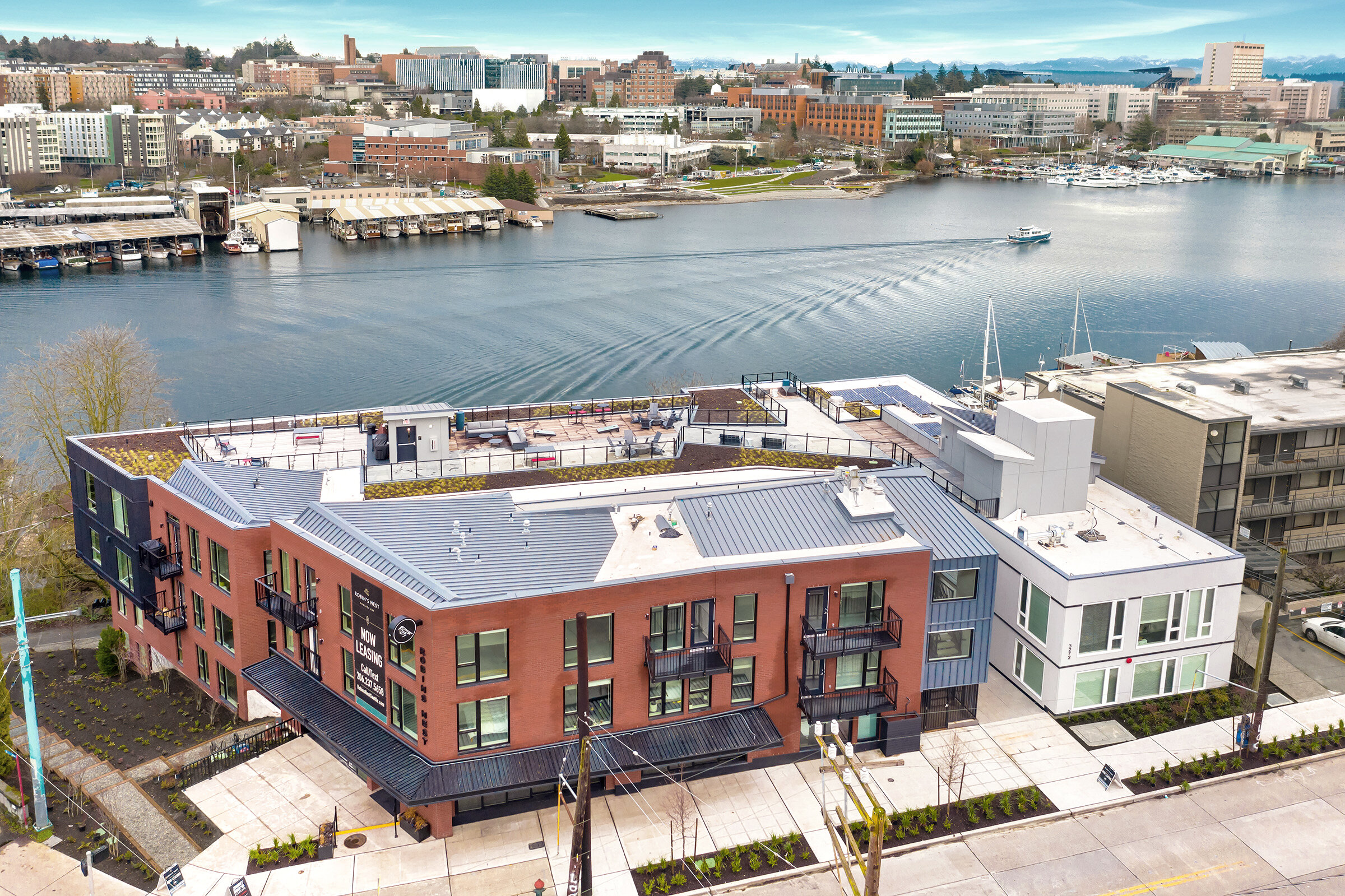
Completed in 2019, Robin’s Nest is one of the most visible and complicated projects b9 architects has ever worked on. As the former site of the first Red Robin, a Seattle institution, and being vacated since 2010, the site holds a unique place in the community. First as a local institution, and second as infrastructure, acting as both improvised parking for adjacent residences along Portage Bay, and as a pedestrian path down the slope from Fuhrman Avenue to the water. During the design and permitting process, b9 architects committed to exceeding the goals of our client, satisfying the desires of the community, and responding to the guidance of the Seattle’s East Design Review Board.

 
2-20200218_b9_rn_051.jpg
3-20200218_b9_rn_160.jpg

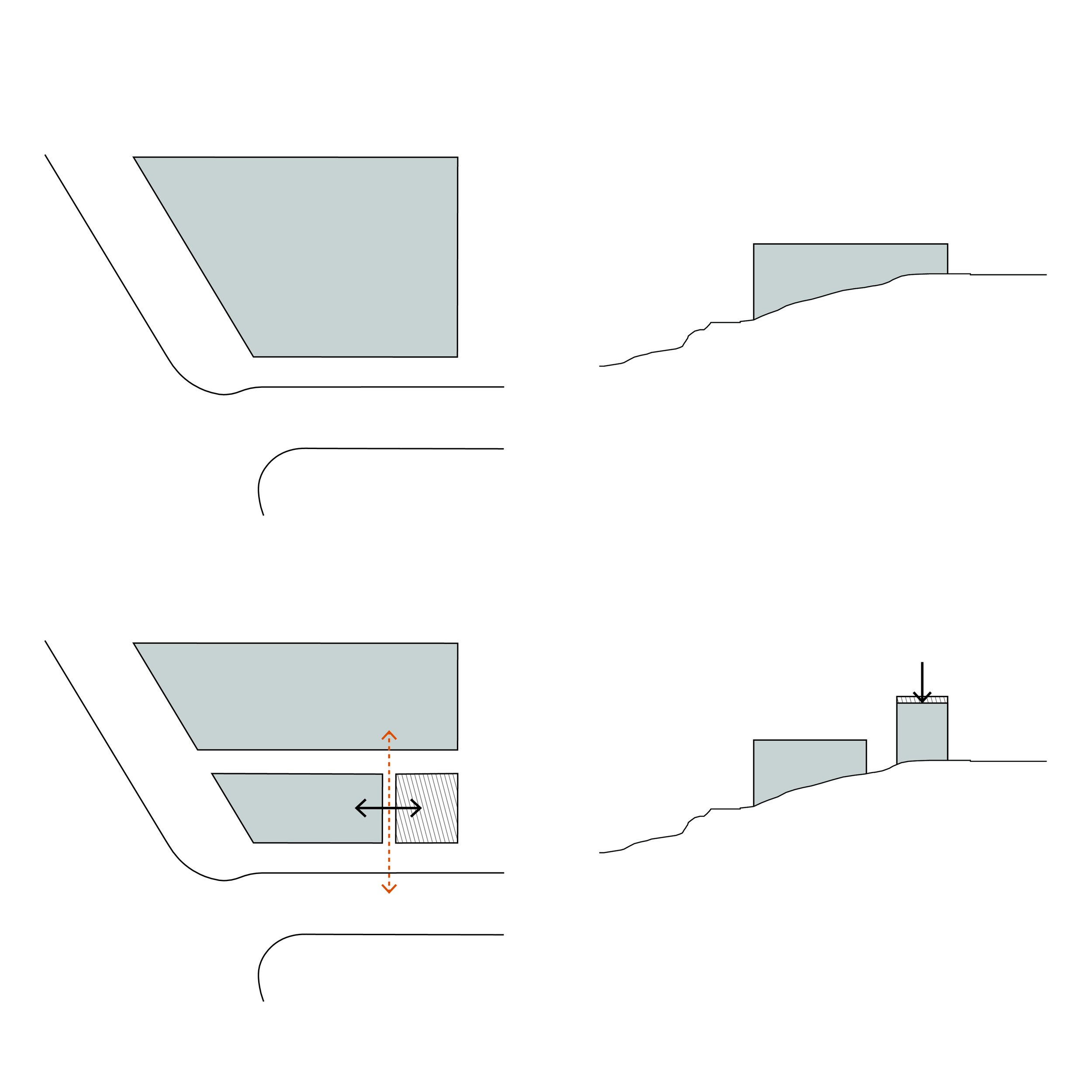
From the outset, the client and b9 architects were on the same page: for a project at this particular site, the biggest priorities were balancing excellence in both design quality and maximizing the potential of this important site. The site’s sloping topography and proximity to the Portage Bay shoreline altered the way we approached the design. The intersection of Fuhrman Avenue E and Eastlake Avenue E at the southern exit of the University of Washington bridge, is highly trafficked and prominent. It was important to both the design team and the Design Review Board, that the corner of this site achieve a scale that matched the other structures on that intersection. Unfortunately, due to the proximity to the shoreline, the expected height limit was reduced by 10 feet.  In addition, the height measurement technique in the shoreline was designed to limit the amount structure height at the highest part of the sloping site, thereby threatening the desired scale at the corner. b9 proposed a solution; instead of a single L-shaped building that would address the corner and front Fuhrman Avenue E and Eastlake Avenue E (University Bridge), the design evolved to an unexpected solution. By splitting the project into two distinct structures, the corner structure could capture the full height limit while a second structure that wrapped around the north and east edges of the site could step down the grade and respond sensitively within the bounds of the shoreline’s height limit.

 
Massing Diagrams_Website-01.jpg
Massing Diagrams_Website-02.jpg
20200218_b9_rn_332.jpg
6-20200218_b9_rn_787.jpg

By breaking the project into two structures, the design team created another opportunity. The space in between the two structures, opened up light and air to units to the north and south  and created a courtyard space at the center. These spaces also establish rhythm in the frontages to both Eastlake Avenue E and Fuhrman Avenue E. The break in the facade along Fuhrman Avenue E is extended via a breezeway through the larger structure, producing a portal to the water of Portage Bay for residents.

 
20200218_b9_rn_897.jpg
20200218_b9_rn_184.jpg

Early in the project, the team decided to recreate and improve the pedestrian access from the entry of University of Washington Bridge to the waterfront. The path residents had been using, was a poorly built wooden stair at the bottom of the sloped Red Robin parking lot. b9 architects began designing a public stair connecting Fuhrman Avenue E to Portage Bay below, to serve the community and create a landscape and trail buffer between the Robin’s Nest site and the bridge. Nine months into the design of this project, the city discovered a 24 inch water main running alongside the project below ground in between the property and the University Bridge. If the pipe would have been touched or moved and subsequently ruptured, the high water pressure released would have been catastrophic.  Significant explorations determined that the pipe was only 4.5 feet below existing grade. These explorations combined with a careful shoring design and installation protected the pipe and the surrounding area, but impacted the scope of the pedestrian trail. Despite this complication the final stair creates a safe pedestrian trail that connects the lower street, Portage Bay Place E, to Fuhrman Avenue E above, providing a direct connection instead of forcing pedestrians to walk under the bridge where visibility on the one-lane, Portage Bay Place E was extremely limited.

 
20200218_b9_rn_538_s_EDIT.jpg
20200218_b9_rn_374.jpg

When the project began the design and entitlement process, as a one-lane road, Portage Bay Place was thought to be a “named alley”, and so any parking proposed by the project would take access from that alley, and with the slope of the site, Portage Bay Place is the only feasible vehicular access point for the Robin’s Nest project. Due to its small size and a potential loss of improvised parking spaces inside the project’s setback, the neighboring community was concerned about the number of cars Robin’s Nest would add to the narrow road. During the Design Review process, Portage Bay Place was unexpectedly determined to be a street due to a mapping distinction discovered midway through the project process  This resulted in many in the community arguing for the project to take vehicular access from Fuhrman Avenue E. A major complication, this led to a compromise with the city by which the project would widen the road surface and provide a vehicular turnout to address the narrowness and length of the one-lane, dead-end road. After substantial delays of the project, b9 took the initiative to present the compromise to the neighborhood and, after informing them of the proposed improvements along the project’s Portage Bay Place E frontage, reached a resolution that allowed the design to proceed.

 
20200218_b9_rn_444_s_EDIT.jpg

In all, the client and design team embraced the opportunity to create a boutique solution that set new standards for a mixed-use multifamily building.  The overall design, exterior material palette,  exterior common spaces, provision of parking, unit mix, interior design, commitment to overall quality and high profile location make Robin’s Nest extremely unique in Seattle.  Considered by many people as impossible to develop due to the steep slope and the City’s and neighborhood’s strong connection to the former restaurant, the site presented the team with multiple challenges along the way. The height measurement technique and restriction in the shoreline overlay, the high pressure water main, and the street improvements to Portage Bay Place all required the team at b9 architects to be adaptable. By responding to each moment with imagination and critical thinking, the team at b9 architects was able to design and help execute an excellent building that highlights the gorgeous views of Portage Bay and the University Bridge.

 
12-20200218_b9_rn_724.jpg
13-20200218_b9_rn_759.jpg
11-20200218_b9_rn_695.jpg
 
14-013020_003_print_EDIT.jpg
Project Spotlight: Wallingford 45

In 2018, the Wallingford 45 project  completed construction in Wallingford, a charming, single-family neighborhood in Seattle, WA.  Designed by b9 architects as an 48 unit apartment, the project spans the transition from neighborhood commercial to multifamily zoning and is one of the first additions of its type to the area in recent years. Bradley Khouri, Principal and founder of b9 architects, and Tom Cole, b9 architects’ Associate and project designer, sat down recently to discuss how they approached the project with integrity and accountability to create an excellent building endorsed by the client and the neighborhood.

 
reduced_edit_20190503_b9_45th_469_s-p1e7qf7f8f99u1lg81tgj1406gf.jpg

“We went into EDG with townhouses on the south parcel,” Tom Cole reflected. A four-story apartment on the prominent corner of N 45th Street and Woodlawn Avenue N had the potential to be radical for the context of preeminently single-family homes. Fortunately, the project site consisted of four parcels, with one to the south of b9’s proposed four-story apartment, which the team used to explore solutions to transition the building into the lower density neighborhood. In their initial design, the b9 team had proposed a duplex and a Single-Family house to sit in between a 40-foot apartment building and the existing lower density context. 

 “After EDG, I remember thinking we should not do this”, Khouri said. “It was impossible to park the houses, because the lot was so narrow.” Instead, the team went back to the drawing board to find a different solution. What they delivered changed the project for the better.

 
2-Aerial Zoning Diagram_two tone-01.jpg
3-West Elevation Transition-01.jpg
4-45 & Woodlawn EDG MUP MASSING DIAGRAM.jpg
0405site plan_MUP_b9_45th_360_s-01.jpg

“We had to have hard conversations with our clients, to take accountability for what wouldn’t work in the first design,” Khouri admitted. Feeling as though the proposed duplex and single-family house isolated the apartment from the neighborhood, the design team chose to explore a more holistic solution to the project. They came up with a three-story apartment structure lightly connected to the larger building. Since the zoning transitions from the previous NC-40 zone to the lower density LR-2 zone, the two structures step down in height from 44’ to 34’ down to its Single-Family neighbor, creating a transitional moment from the commercial core to the adjacent neighborhood. To further heighten the connection to the lower density neighborhood, the front unit of the smaller apartment has a stoop leading up from the street. With their solution fully formed and approved by the client, b9 submitted for a Master Use Permit and asked the Wallingford Community Council for a meeting, to ensure their voices were heard.

 
5-Elevation Setback Diagram 2-01.jpg
6-Elevation Setback Diagram_3 MUP-01.jpg
7-Marketing Render 2.jpg

At the meeting with the Wallingford Community Council, it was apparent that the neighborhood was apprehensive about the project. “This was potentially the first new project along this stretch of 45th. We were very interested in how it could be an identifier for the neighborhood,” Tom Cole reflected, but that goal would add a level of density to the neighborhood that is uncommon. N 45th Street is an important commercial stretch in the heart of Wallingford, “but it’s depth along 45th is shallow” remarked Bradley Khouri. Within a couple blocks of this strip of commercial, in which the code allows more height and density, are vast blocks of lower density uses, primarily Single-Family homes. “It’s different from many of the urban centers of Seattle, in which the concentration is more of a radius from the center, like Capitol Hill, Fremont, or Ballard”, according to Khouri. As a result the context is different from other neighborhoods in the city, as well as the priorities of its neighbors. “It became an important focus for the project,” said Cole.

“They had a concern that there was so little parking and so much density, that no matter what we did, it would be a negative contribution to Wallingford,” Khouri remarked. In addition, during Seattle’s review of the Master Use Permit application, the city eliminated the definition of “frequent transit”, due to an appeal to the Hearing Examiner on another project nearby.  This resulted in a concern for b9 that this project’s MUP would be appealed, as it relied on Seattle’s frequent transit definition to create a new mixed-use project with no parking requirement in Wallingford’s Residential Urban Village.  To allay this concern and avoid a potential appeal of the MUP, Khouri, Cole and the design team proposed two significant changes. First, they added an underground parking garage beneath the structure with twenty vehicular stalls as well as bicycle parking to reduce the amount of vehicles on the street. The second, was to re-examine the cladding in order to improve the perceived quality of the building. Up to now, the team had proposed a mix of metal and wood cladding. At this point, to give the building a more classic feel, Khouri and the client agreed to clad the majority of the project in brick and metal. These decisions not only convinced the Wallingford Community Council on the efficacy of the project, they also helped shape an elegant project.

 
8-20190503_b9_45th_360_s.jpg
9-20190503_b9_45th_347_s.jpg

Located at a prominent corner in a largely single-family neighborhood, Wallingford 45 creates an excellent example of a neighborhood solution.  It spans the transition from commercial to small scale residential, with a historic building to the east and quaint single-family dwellings to the south. Three high-quality massing and material strategies help to break the project into three smaller, connected structures. This is a direct response to the scale and texture of the existing urban fabric, with each approach articulating one of three prominent, visible facades. A departure for b9 architects, two community spaces are detached from the ground level and separated from the street. A raised courtyard space above the residential lobby breaks the corner volume into two smaller, somewhat repetitive elements. This internal courtyard is lifted above the street in the center of the building so as to minimize its impact on the neighborhood while activating the center of the project. Similarly, the roof deck is pulled back from the edges of the building to maximize privacy for adjacent structures. As a mixed-use building, with two commercial storefronts fronting 45th Street with one wrapping the corner to Woodlawn Avenue N, the individual cladding strategies creates a break giving each commercial space its own identity. At the corner, a space designed for a restaurant has been tenanted by Grand Central Bakery, a regional staple that makes fantastic use of a raised patio that extends into the right of way and connects the commercial space with the pedestrian area.

 
10-20190503_b9_45th_299_s.jpg
11-20190503_b9_45th_448_s.jpg
12 edit_20190503_b9_45th_520_s-p1e7ol53fe1ogt7b16q9177g1131-0.jpg

By approaching an impactful project from the beginning with integrity and with a spirit of collaboration, b9 architects’ and its client created an excellent project that has been well received by its immediate neighbors and its local community . The integrity of the client is visible in their creation of a program entirely of one-bedroom units, with below-grade parking and a commitment to a high quality execution. The raised courtyard provides access to daylight on two sides for a majority of the units. . The integrity of the Wallingford Community Council, after reviewing the team’s responsive design, to speak out for a project they believed in. b9 architects’ integrity in recognizing a poor design solution early on created a moment of transition that better connects the project to its adjacent commercial and residential neighbors. In this case, a values-based project design resulted in a high value project.