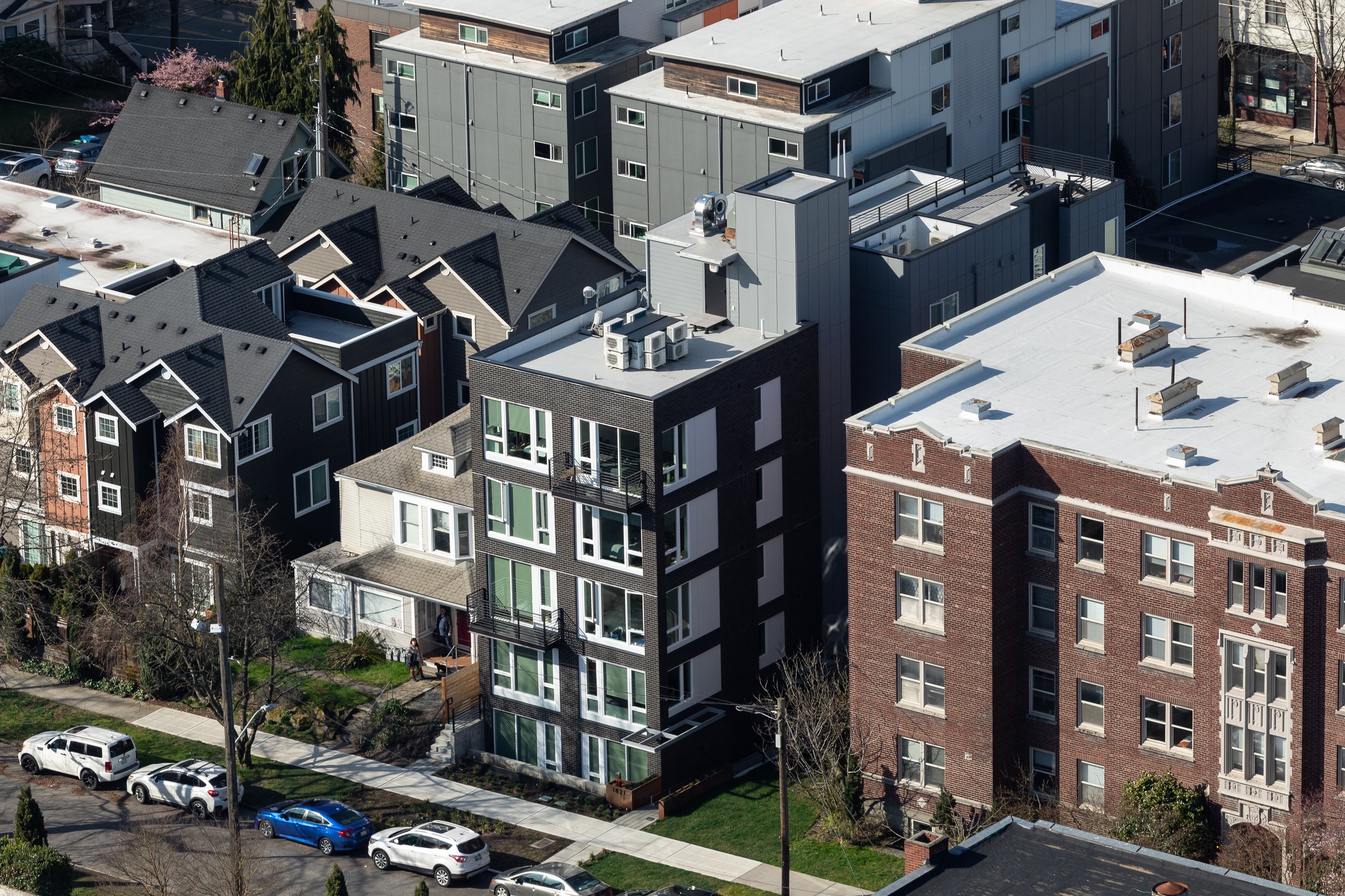
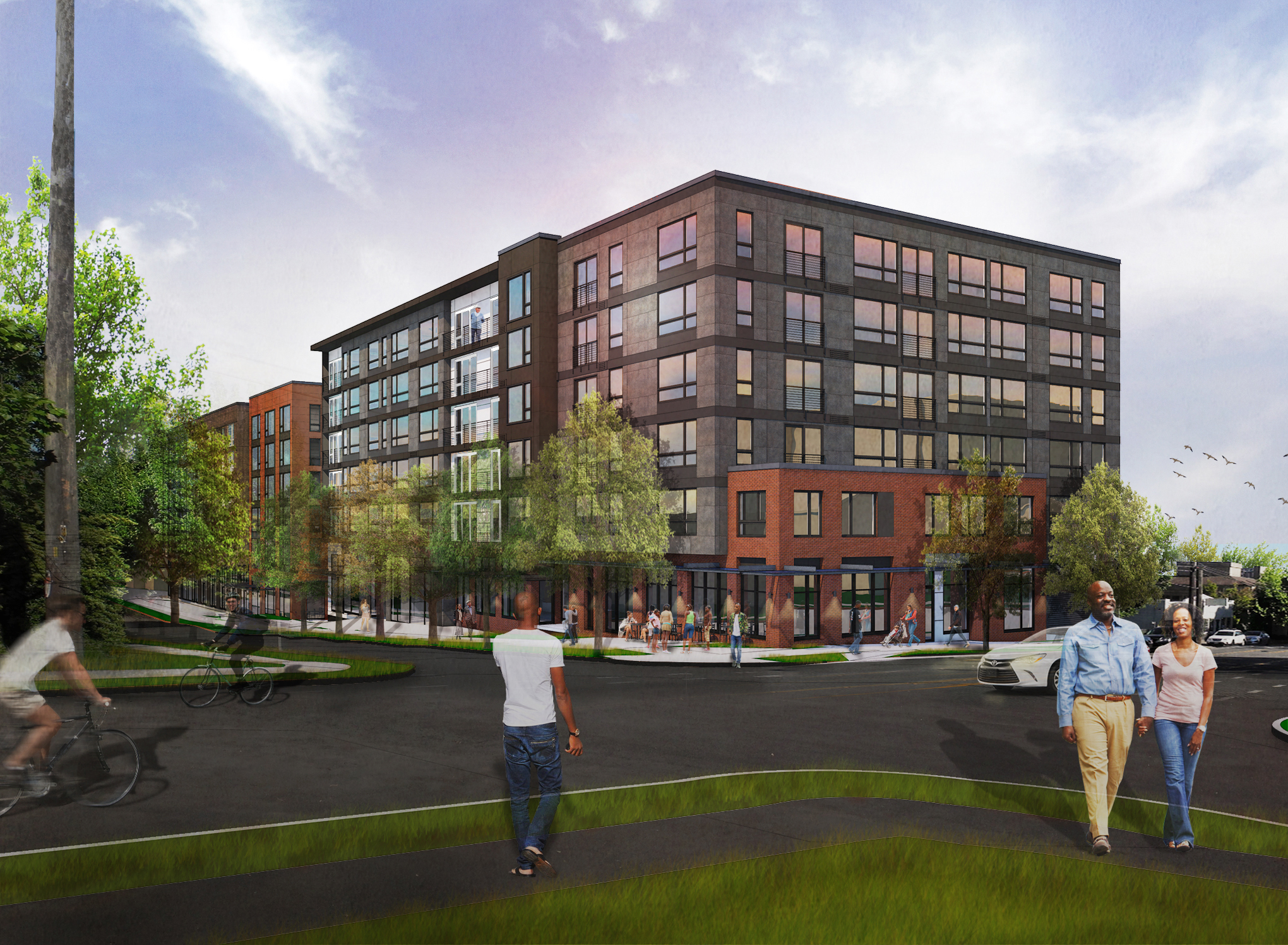
The Madrone Apartments, located in Seattle's Central Area, represent a radical approach to urban residential development to achieve excellence in sustainability. Comprising 107 units spread across two distinct yet interconnected “towers”, this project redefines high-density living with its innovative design and commitment to sustainability. Built on two compact infill sites, the eight-story development creatively maximizes the available urban space while offering a unique living experience that blends privacy, comfort, and environmental responsibility.
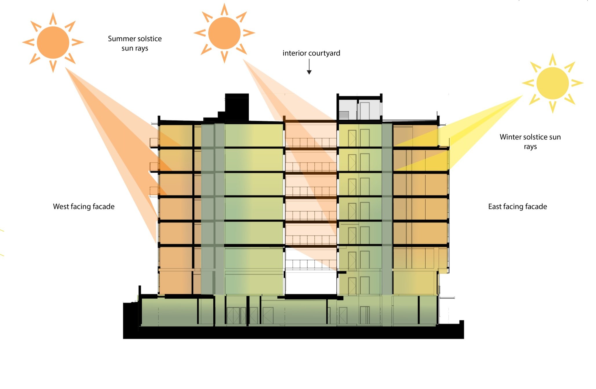
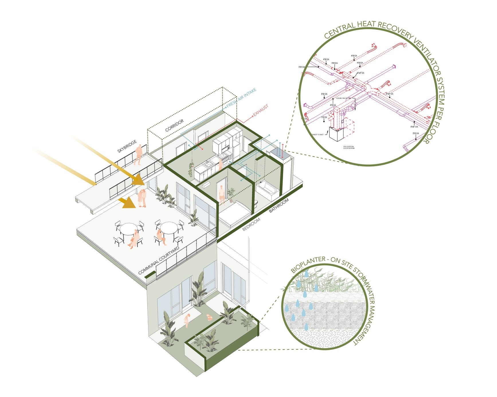
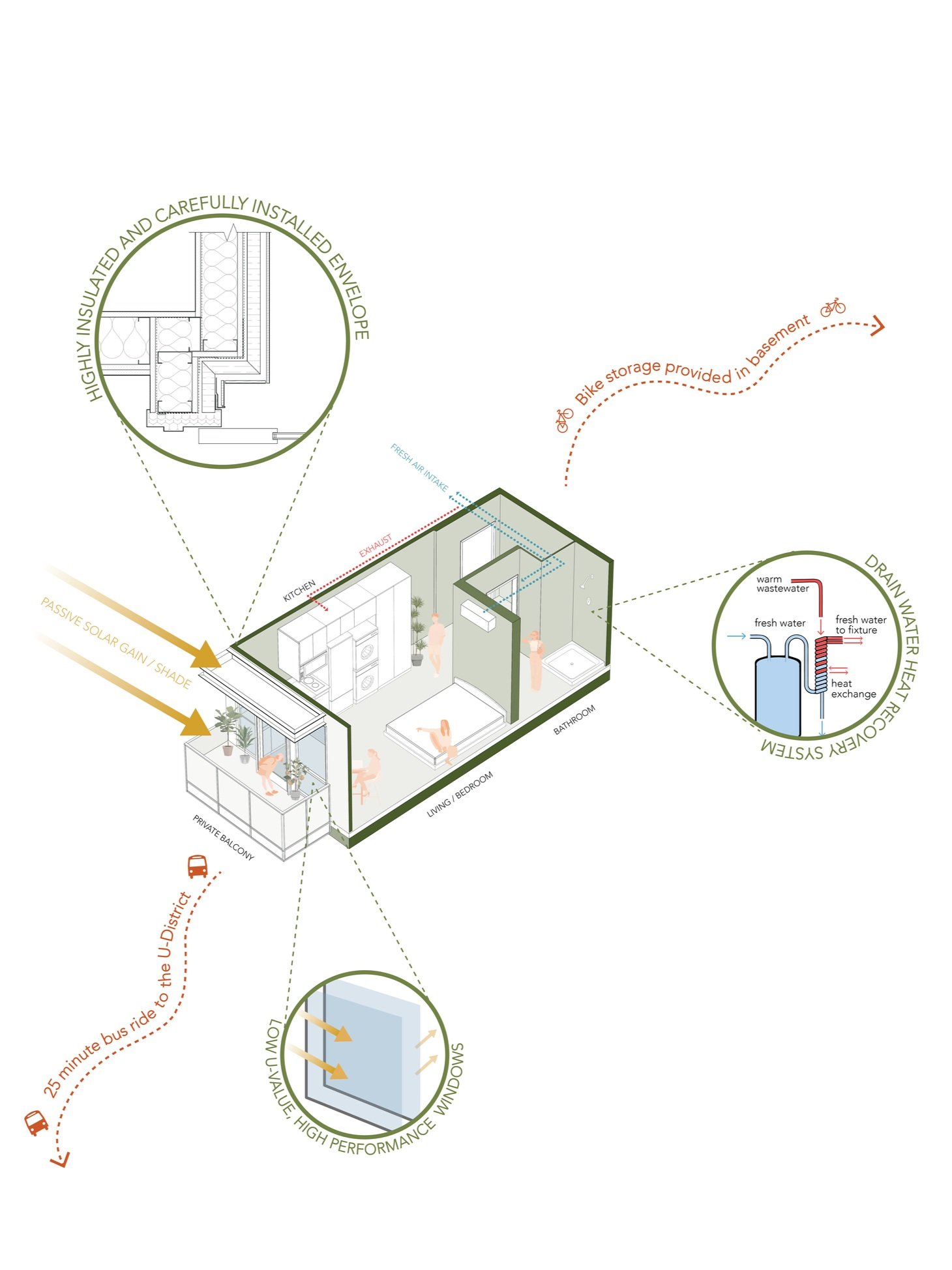
One of the most notable aspects of the Madrone Apartments is the project team’s commitment to sustainability. The project is certified by the Passive House Institute of the United States (PHIUS) as a Passive House Multifamily Apartment building, a globally recognized German benchmark for energy-efficient construction. This standard is achieved through a highly insulated building envelope, which utilizes state-of-the-art materials and technical detailing to effectively retain heat and maintain consistent indoor temperatures. The inclusion of high-performance windows further enhances the building's thermal efficiency, reducing energy loss while maximizing natural light. This strategy manages solar gain to exploit the sun's energy for heating purposes in the heating season and to minimize overheating during the cooling season. Where necessary, some units provide cooling to offset the potential overheating in the summer months.
The focus on sustainability extends beyond just energy efficiency. By prioritizing these principles, the Madrone Apartments not only lower operational costs for residents but also significantly reduce the building’s environmental and carbon footprint. The Passive House design approach and standards deliver superior air quality and comfort for residents while creating a resilient building, with long-term performance as the expectation for owners and residents looking to maximize a building’s lifetime. The design process to produce a Passive House certified project involves the entire consultant team as early as the Schematic Design phase. This is unusual compared to most urban housing projects.
The interconnectedness of the structure with the envelope design, the mechanical design with the floor plans and building elevations, the plumbing design and the electric design contribute to the unique solution for Madrone. This approach creates a healthier living environment, contributing positively to the overall well-being of its residents and the broader community. As extreme climate events such as wildfires, heatwaves, and winter storms become more common every year, the region’s housing supply will need to increasingly meet demands to protect residents in what has historically been a temperate environment.
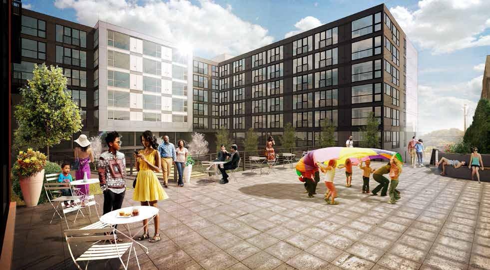
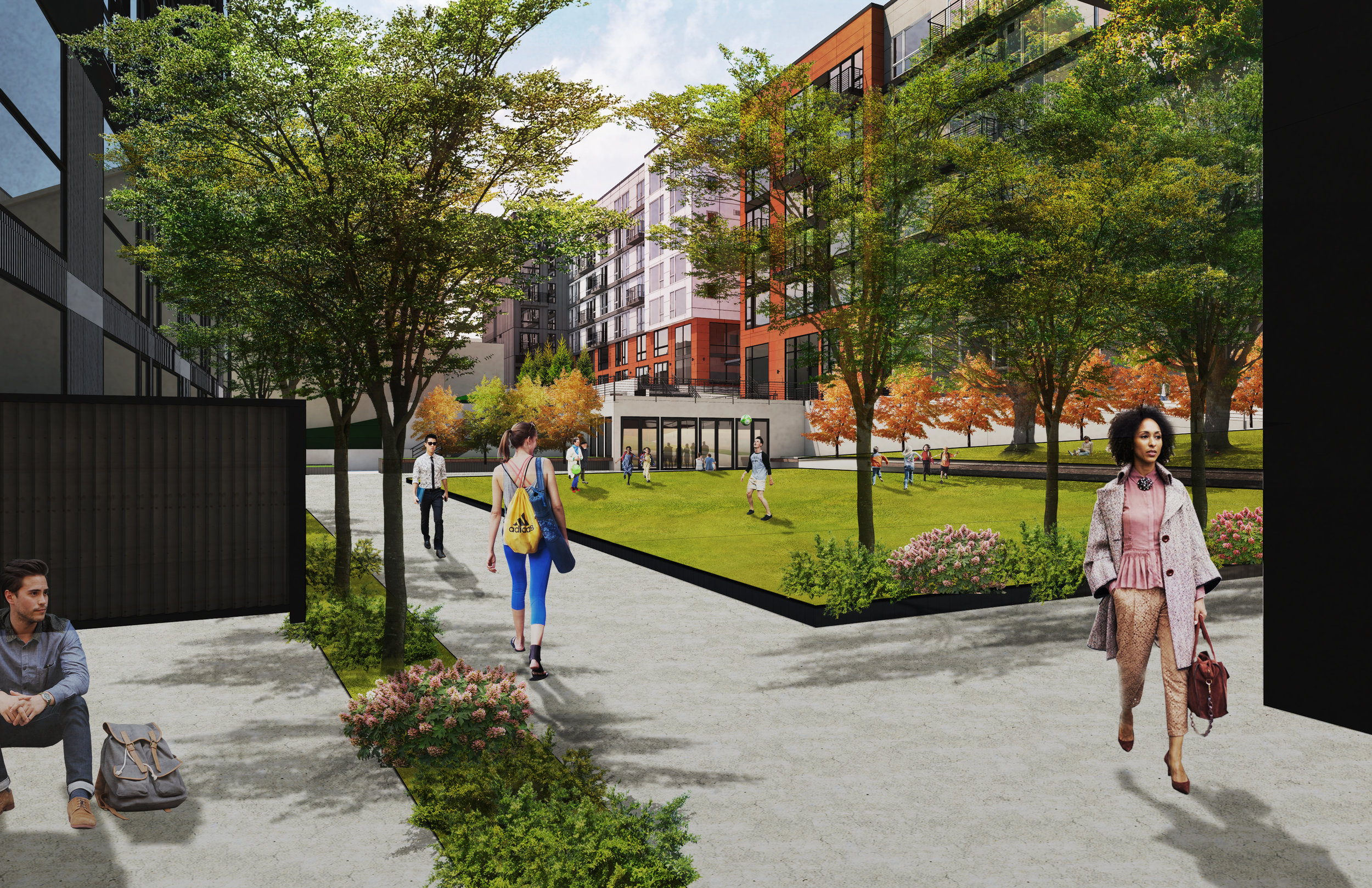
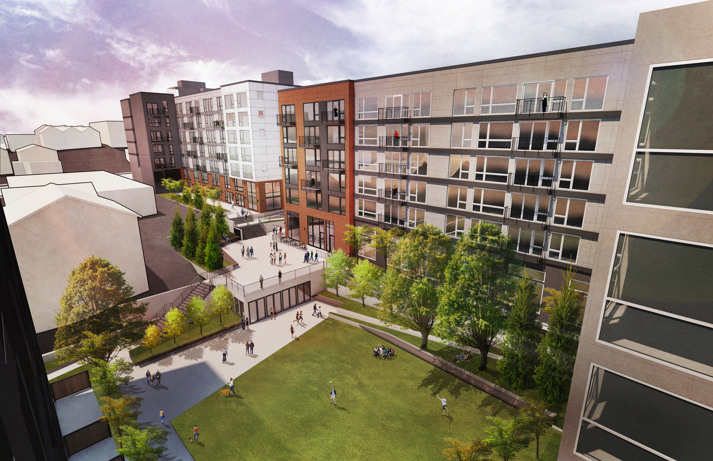
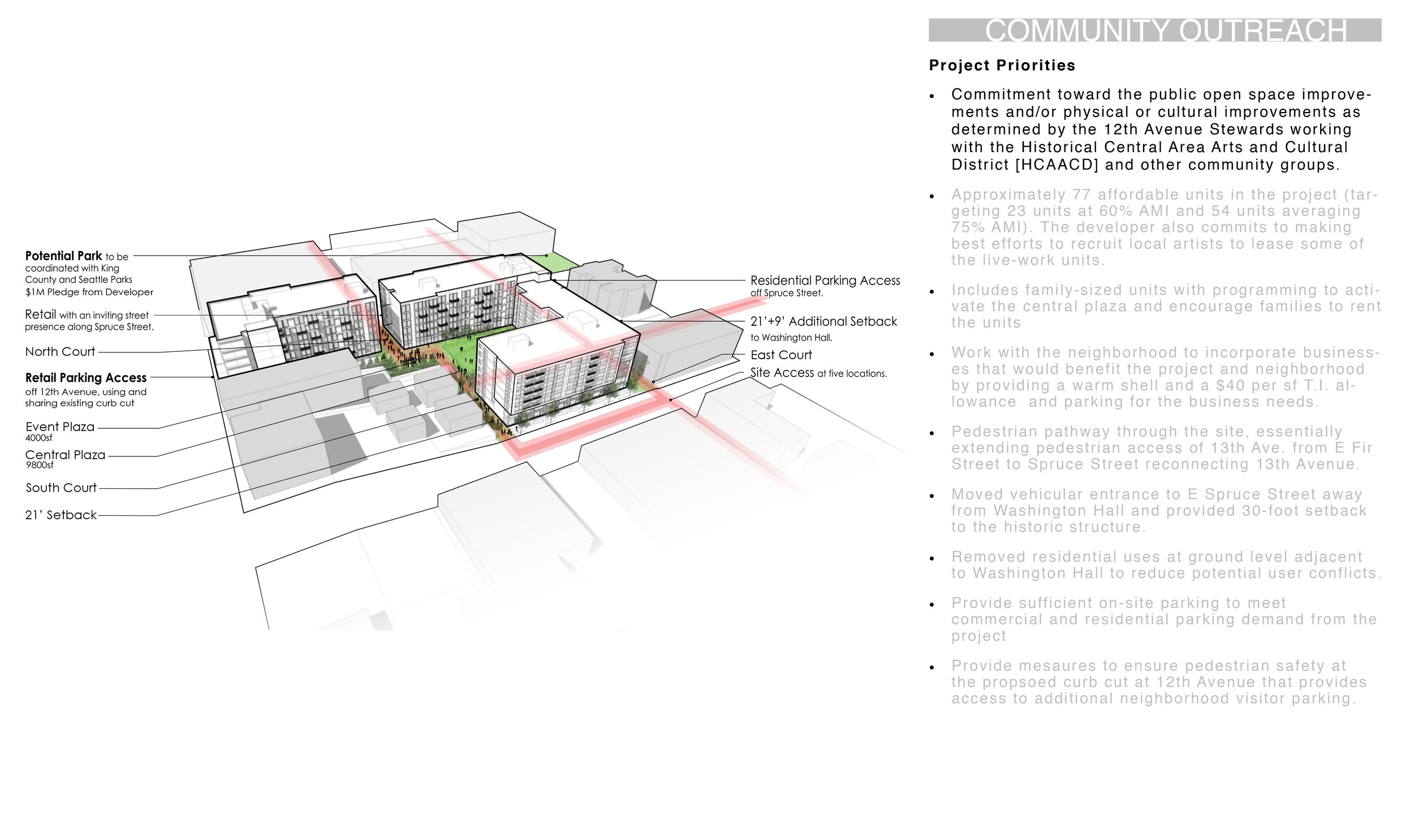
The Madrone Apartments feature two separate “towers”, connected by an exterior bridge that spans a centrally located courtyard at each floor. This strategically splits the project into two masses and allows natural light to pass through to adjacent sites. The bridges connecting the two towers also serve as a unique architectural feature that enhances the overall aesthetic of the complex. This element creates a visual link between the two sides of the building while also providing a sheltered exterior passage for residents. The bridges, combined with the courtyard further contribute to the development's sense of cohesion and unity, providing a shared space for residents to gather, relax, and enjoy the outdoors. This quiet and often shaded courtyard provides a sheltered place on the site that is not subject to the increasingly hot summer sun and wet Seattle winters. Multiple bioretention planters located at the courtyard level manage onsite stormwater collection from the building roof within the project.
A key design priority for the Madrone Apartments is maintaining privacy in a high-density urban setting. All residential units are thoughtfully oriented away from adjacent buildings, either outward, with windows facing the street, or inward, overlooking the courtyard or to the rear of the adjacent empty lot. This deliberate design strategy ensures that both residents and neighboring properties experience a sense of separation and privacy, which is crucial in densely populated urban areas. The result is a harmonious balance between community engagement and individual seclusion, catering to diverse resident needs.
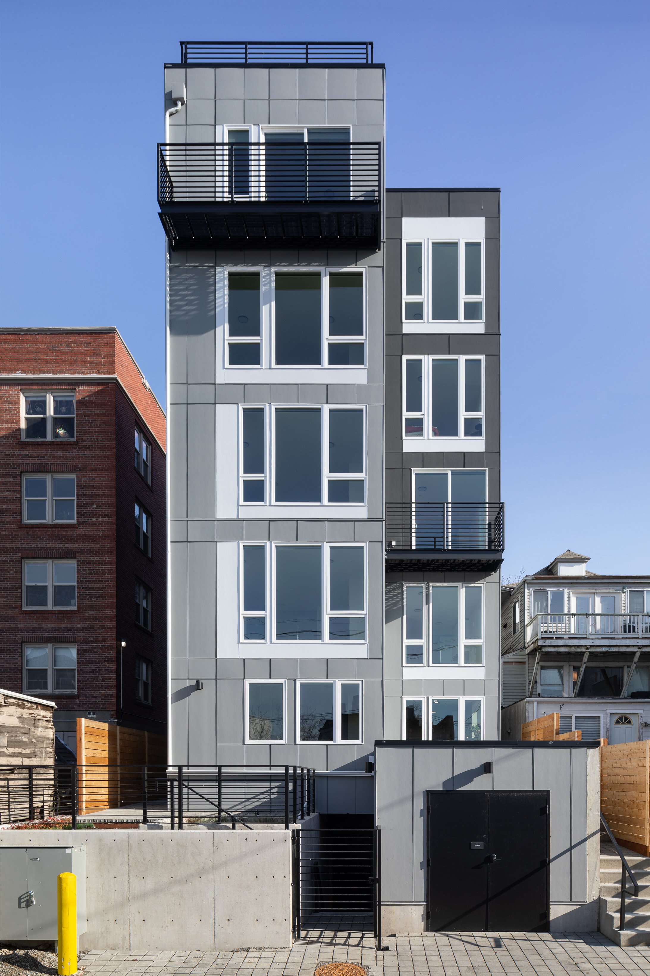
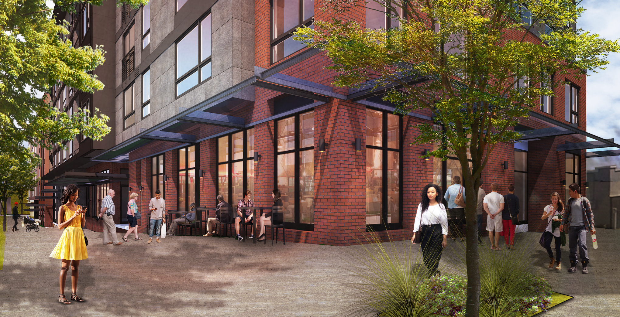
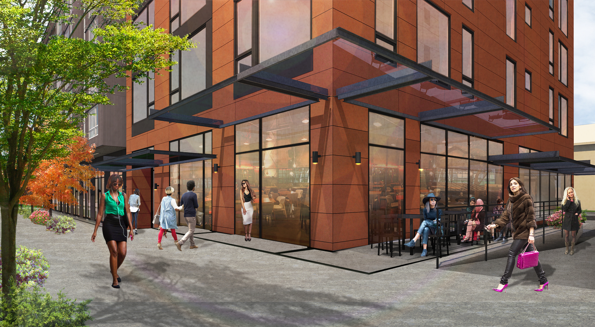
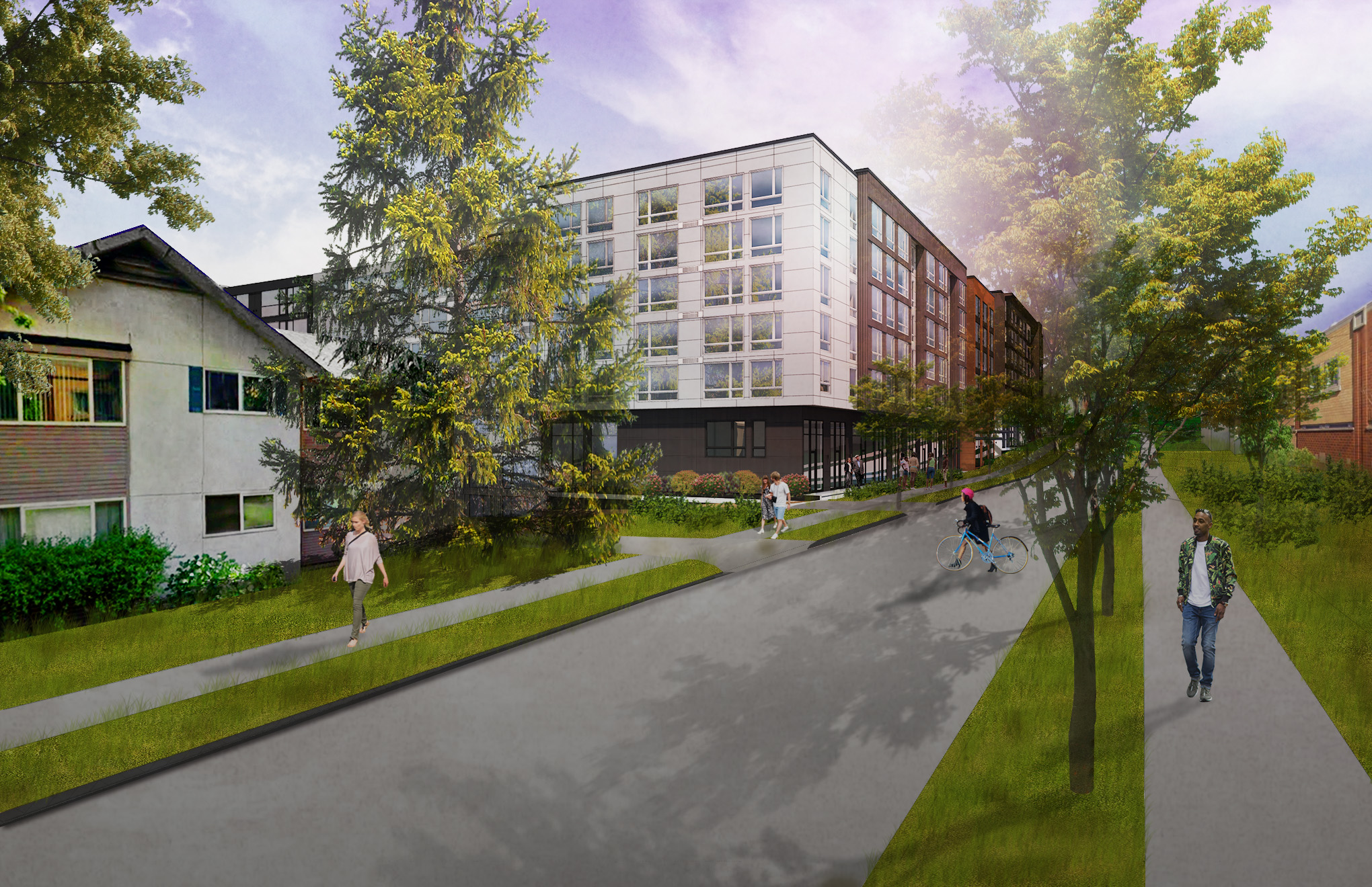
A straightforward material palette and elegant facade design contributes positively to the neighborhood’s character and increasing modernity and allows for a more timeless presentation that will age cleanly as adjacent areas are developed in the future. An upper level setback was provided voluntarily to the street to reduce the height and overall mass facing the low-rise zoned lots across the street. This recess aligns with a jog in the facade’s massing at the north corner, creating a transition towards the currently underdeveloped property immediately to the north. While the material palette was intentionally kept simple and elegant, quality and texture were prioritized wherever residents or community members were most likely to interact with the project’s facades. The majority of the exterior materials are integrally colored or prefinished, providing a thoughtful and durable solution. All windows are high performance and feature a projecting prefinished metal trim that adds pattern, depth and texture to all east and west facing facades.
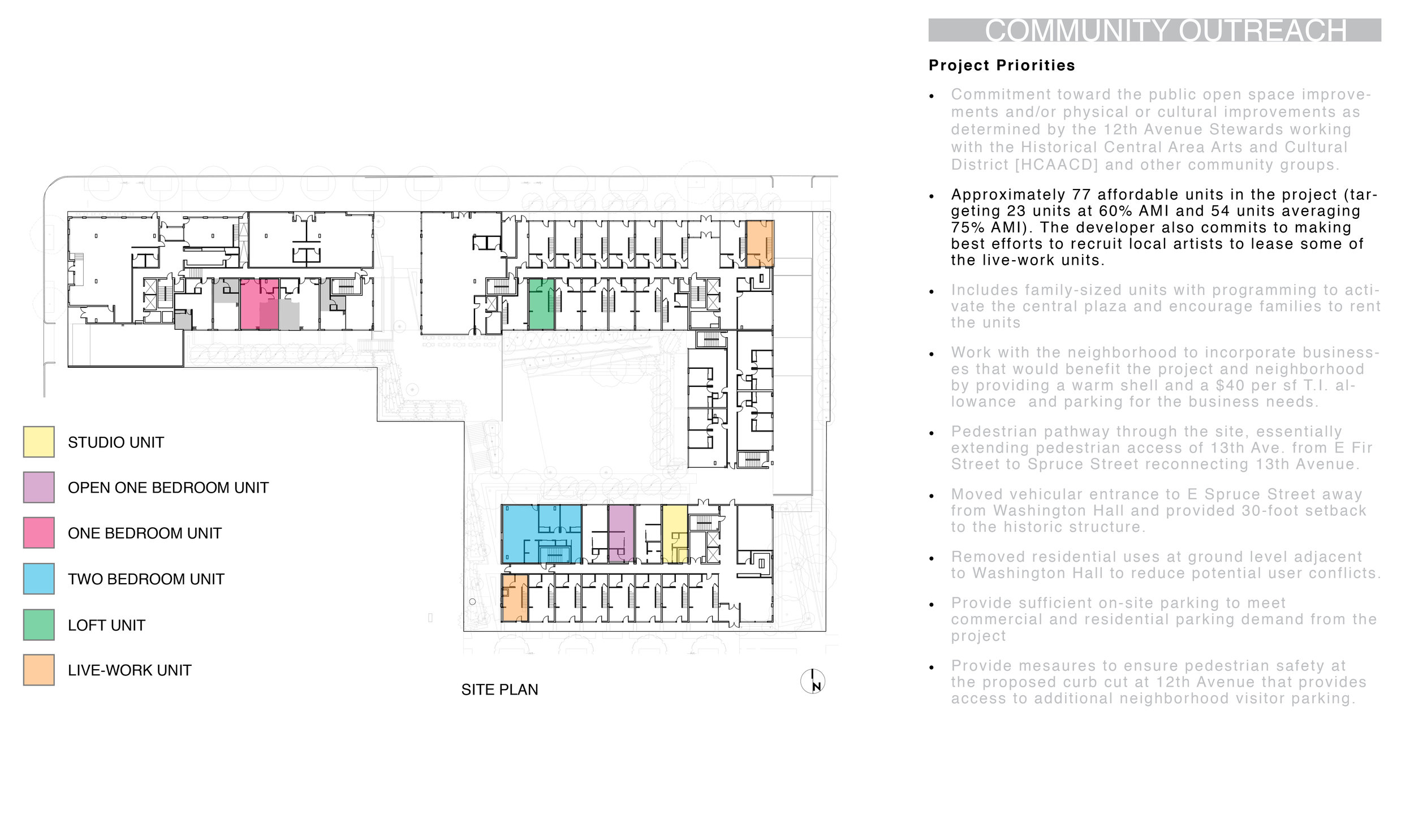
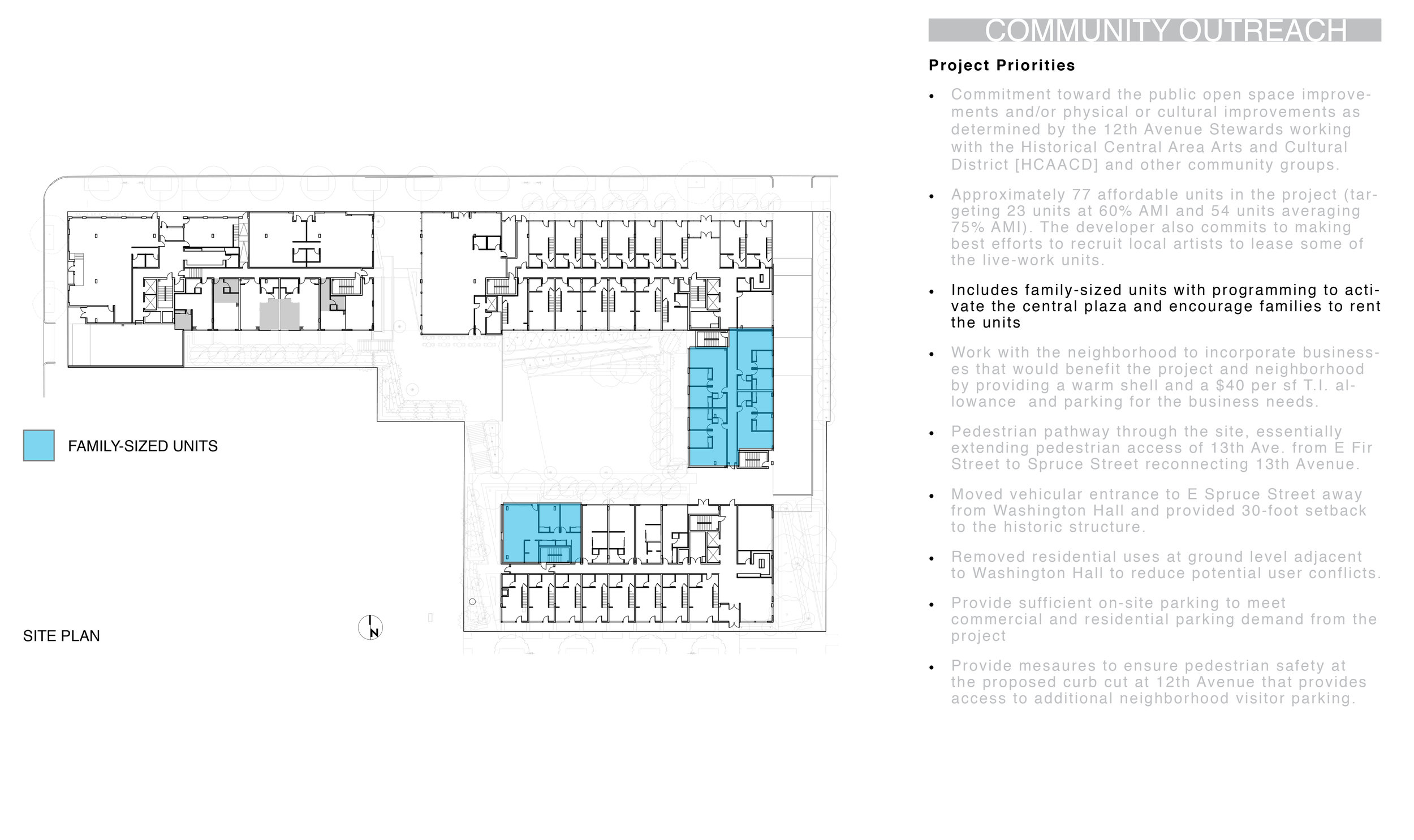
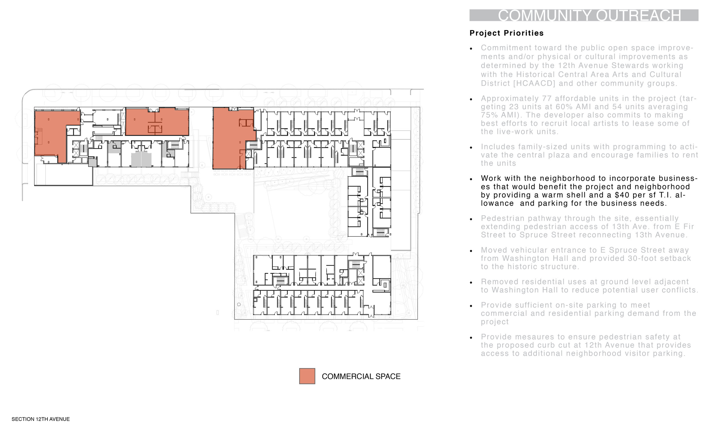
The Madrone Apartments are situated in Seattle's Central Area, a neighborhood rich in history and cultural diversity that has undergone significant transformation over the past decade. Historically, the Central District has been one of Seattle's most racially and ethnically diverse neighborhoods, and was once the center of Seattle's black community and a major hub of African-American businesses. However, recent years have seen a wave of development, with numerous multifamily apartments rising to meet the growing demand for urban living. Amidst this rapid urbanization, Madrone Apartments stands out with a thoughtful approach that balances needed housing density at a time when Seattle faces a massing housing shortage, with quality construction and a long-term design intent. By maximizing the unit count within the constraints of two compact infill sites, Madrone not only contributes to the area's ongoing evolution into a bustling urban hub but also creates opportunities for affordability. The project’s design ensures that a high number of units can be accommodated without sacrificing space or comfort, making it possible to offer a mix of living options in a neighborhood where such opportunities are increasingly necessary. This approach aligns with the neighborhood’s history of inclusivity, aiming to provide a diverse range of housing options for its residents. The site’s location has one of Seattle’s highest ratings for walkability and bike transit access, supporting residents who work and recreate at a neighborhood scale. This access further supports the growth and redevelopment of small businesses in the immediate area.
The Madrone Apartments represent a sophisticated approach to urban infill development, skillfully balancing the priorities of sustainability, privacy and density. By optimizing the use of two compact mid-block urban sites, the project sets a new standard for urban living within the existing neighborhood fabric. By adhering to the Passive House standard for design and construction, the Madrone Apartments exemplify a commitment to produce innovative, sustainable, and community-focused design.
